To create my ancillary texts I took plenty of images whilst in New York as I did not know exactly what I wanted as my ancillary texts, all I did know was that I wanted it to featured New York in all its forms such as the nature, the architecture, the history, the people and the new elements to it. I uploaded them to my computer on my return and imported them to Adobe Photoshop CS5, where I tested different editing techniques out in order to get the image i was happy with. From viewing all my photos i narrowed my magazine advertisement image down to two, one of an elephant in the natural; history museum and one of a statue in the natural history museum also. I chose these images as the elephant image creates different connotations for the audience allowing them to be subjective in their interpretations - uses and gratifications theory - and I also chose the image of the statue in the natural history museum as it had neon colours that looked really effective.
Before Editing
Before Editing


These are the images before editing, after looking them on the computer I wanted to edit the brightness and contrast of both images to make them look more vibrant and crisp.
After Editing


I feel as thought altering both the brightness and saturation of both of the images they look better quality images and they follow the abstract theme Intended to create. I then went on to create two drafts of my magazine advertisement with the images as I could not decide which image to use so therefore I asked feedback off my audience. I also used both images in my digipak to create continuity and to reflect the different aspects of New York. Additionally, the image of the statue features in my music video in video format which ties all products created together. I experimented with the layout of my magazine advertisements with both of the images and then went on to ask for audience feedback to see which advertisement they preferred and what elements they felt looked effective in keeping to conventions. From this feedback I found that the most effective magazine advertisement was the elephant image with the main reasoning that this image also featured on the front cover of my digipak. Both of the images feature both in my digipak and in my music video creating continuity between the two.


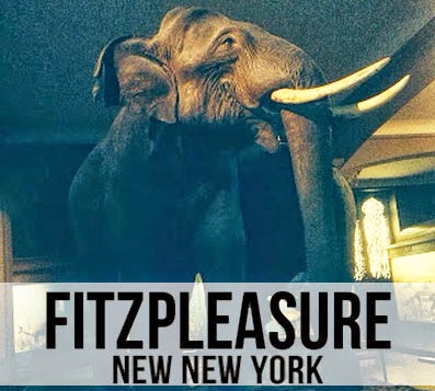
 I liked the layout of the white rectangular box which featured the band name and logo directly in the middle of the advertisement therefore carried this layout over to both drafts of the magazien advertisement and to my digipak front cover. To keep with conventions of magazine advertisements I sized the album name so it was the biggest text on the advertisement to grab the audiences attention. The text on the magazine advertisement is the same font - Bebas Neue, found on 'Dafont.com'- to create continuity between the magazine advertisement and create recognition between the band name and the album name when placed on the digipak allowing the combination of my ancillary texts to work very effectively.
 Creating the band name was essentially very difficult for me as I really like the original artists name of Alt J as i think its very creative and unique, this gave me the inspiration for me to try to use the same technique on my first draft of my band name of - All- in one' as it thought it was short and simple. However, I knew it did not fit with the new york theme of my campaign as therefore I chose to name my band 'New New York' to reflect the type of styling I wanted to show in my ancillary texts and my music video. This band name went well with my ancillary texts and looked effective on both of the ancillary texts.
I then wanted to create other means of contacting the band via social media sites such as Facebook and Twitter so included both of the website address' along with the logo's of both on to the poster. Also to keep with conventions of magazine advertisements I felt as though I wanted to include a verdict of the album from well known music magazines in the industry such as NME and MOJO which helped to promote the album and the music video. The combination of the main images linked all aspects of my campaign to create continuity and effectiveness throughout my products. I showed the development process of creating my magazine advertisement and digipak with screen shots as I created both ancillary texts.
 I felt it was important to show both of my ancillary texts as real existing products in the industry so as well as creating edits of my album cover on iTunes I decided to create both my magazine advertisement and my digipak . I printed off my magazine advertisement and placed it inside MOJO to make it look as though it was a real product featured in the industry and asked for feedback on whether the advertisement looked believable. I got good feedback from this and felt happy that I had followed conventions correctly and had made an accurate industry looking magazine advertisement that reflected the abstract digipak and music video. I did this as an alternative way of finding an image of an open magazine and editing it on to the image as I feel this reflected the image as a real life product more effectively.
 I wanted to make sure that both my ancillary texts reflected the abstract narrative I wanted to create in my video so therefore used a collection of images I had taken in New York both on my Nikon Coolpix L120 and my Apple iPhone 5. These images were of good quality and once I edited them on Adobe Photoshop CS5 they looked very effective. I chose not to use an image of my main cast member as I felt it would diverge from the abstract feel to the campaign and therefore in my music video I also contrasted the image of the male cast member performing with images on New York. I chose to use mainly footage taken in Times Square at night to capture the neon lights contrasted against the dark night so additionally felt the neon image of the statue that also features in my video should be clearly visible in the digipak. In the process of creating my digipak I experimented with different styles for both my front and back cover. I originally liked my second draft back cover, however it looked out of place and did not fit with my abstract theme although it did look industry standard. Due to this I changed the image on the back cover and the rectangular boxes at the back of the text to make it fit with the colour scheme and look effective.


Third Draft
As I did with my magazine advertisement I wanted to create my digipak as if it was a real product in the existing industry. This allowed me put both of my ancillary texts together and see how effective they looked in complementing each other and my music video. I was happy in concluding that from looking at my digipak and my magazine advertisement that both of them fit the abstract theme, reflected the New York aspect, and the continuity could be clearly seen between due to the use of the reduced opacity white boxes, the same elephant image and the same font of text used.


The main challenging aspect of creating my digipak was choosing the right images to complement each other in my digipak as I took so many I wanted to use them all. Because of this I chose an image that represented all aspects of New York. Once I chose the images I found it hard to fit the image on the template without distorting the image so therefore on some of the images I have cut off the edges in order for them to fit. However, I do not think this effects the quality of my digipak images and I am pleased with how they have turned out.
I asked two people within my target audience whether or not they thought my media campaign complemented eachother and how effective they were.
The feedback I recieved on wether my media products work well as a media campagin were very positive however, the male interviewee made a comment referring to my magazine advertisement reminding him of a museum. I didnt really understand this comment but if I was to produce this media campaign again I would maybe feature the artist on the magazine advertisement to avoid confusion.
No comments:
Post a Comment