From looking at the history of music video's it gave me an idea as to how music videos have developed over time and how the different forms of narrative have occurred. It also allowed me to understand the basic form conventions of music videos. Therefore from this research and the analysis on music video's I produced a Prezi that I could relate back to for the information I found on the conventions of music videos in relation to Mise-en-scene, Cinematography, editing and sound.
The conventions of form include fast pace editing and editing on the beat of the song, an element which can be seen in my music video. This is to keep the audience entertained throughout their viewing and to reflect the mood of the song in some cases. Another convention of form is to use a variety of shots, such as close ups, extreme close ups - normally used for lip sync- medium close ups and long shots. Long shots are the most infrequent and are used as establishing shots to set the scene. The most frequent shots are close up's and medium close up so the audience can see the facial expressions of the artists and can establish the mood of the song.
Shot such as tilts, pans and tracking shots are also conventional to form as the help the audience to follow the narrative of a song and can reflect hidden meaning to the narrative of the lyrics. They could also be used simply to just follow the artist.
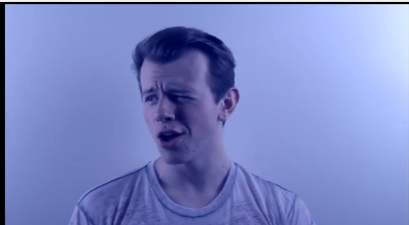
A range of different shots used in my music video is a way in which I used conventions of form. Also, I found it was conventional in indie rock music videos to have the main artist lip syncing with medium close up shots. However I challenged conventions by using extreme close up shots of a lip sync that are normally used in pop music videos. I did this because I wanted to portray an aspect of rebellion within the cinematography that is connoted with the label of indie rock. It is important that varied shots are used within a music video and shots at different angles so therefore I used as many different types of shots as I could. In the New York scenes I wanted my audience to feel involved with the on screen shots and to do this I used a handheld camera that allowed me to capture shots from my perspective and additionally, the audience's perspective.
Close up shot. Double exposed upwards tilt.
Extreme close up shots.
Self reflexive long shot.

Medium close up shot.
The screen shot of my music video on Adobe Premire pro CS6 shows the fast pace editing through the shot vidoe clips present and the performance clips which look longer are then double exposed with abstract clips of New York scene. From watching my video it is evident that the clips are edited to the beat of the music to keep with conventions of form. Additionally, the longer performance shots are also double exposed with juxtaposed fast pace shots of New York shots and extreme clops up lip sync shots throughout.
 After identifying the conventions of form I then looked at identifying the conventions of my chosen genre - Indie Rock. I conducted several analysis' of indie rock music videos to be able to identify the conventions of the setting, narrative, Mise-en-scene in relation to costume and props, editing and cinematography.
 Conventions of indie rock by laurenbeardshaw on GoAnimate

I found that the artists appearing in indie rock music videos tend to have plain t shirts on and jeans, predictable everyday attire in comparison to pop videos who's music video consist of them in surreal settings and wearing over the top clothing to accompany the setting. For this reason I chose to have Brandon wearing a plain white and plain distressed look t shirt for the performance element of my music video to stick to conventions.
However,indie rock music videos tend to be set in everyday settings to create social realism and have elements of performance juxtaposed with either a narrative or abstract scenes that have no real meaning other that iconography reflecting the lyrics. I challenged conventions of an everyday setting to create social realism by having the main bulk of my music video set in New York. I chose to do this as I wanted a more arty feel to my music video rather than sticking to the everyday life feel I wanted to bring an element of wonder to indie rock rather than the typical day to day - what you see, is what you get aspect. I also reinforced this challenge of conventions by using colored effects over the performance images rather than having the clips in black and white - which is a convention of indie rock, an element which indie rock band Arctic Monkeys use frequently in their video.
Additionally, I challenged the conventions of indie rock and music videos by have frequent cross dissolves in my music video instead of straight cut edits that are conventional. This was again to create the arty aspect and I felt by having cross dissolves it accompanied with my chosen song better. I still used a few straight cut edits when the tempo of the song increased.
Another way in which I challenged conventions of genre is by not using props such as instruments at any point in my video as I felt it wasn't necessary for my music video to feature them due to the styling of the song being more edgy and alternative then the standard indie rock. It is hard to analyse conventions on Alternative music because the artist essentially plays around with their own styling etc.
The use of harsh lighting to create shadows is also a convention of indie rock and I tried conform to this convention by altering the input of the lighting whilst editing. I did not create as much of a shadow behind and on the cast member as I would have liked and should have altered the lighting whilst filming instead of trying to add them whilst editing.
The challenging and conforming of conventions can be seen in my video in comparison to and indie rock music video - R U Mine by Arctic Monkeys.
To accompany my music video I chose to produce a magazine advertisement and digipak as part of my campaign. I researched the conventions of both magazine advertisement and digipaks both on the internet - web 2.0- and on print. Once I had established the conventions of magazine advertisements and digipaks in the indie rock genre, I produced an analysis of conventions and began planning my own media products.
After analysing magazine advertisements I carried over all of the conventions as I feel it looked very effective and tell the audience all the need to know about the album and when its released. I used the same image as my digipak cover to create continuity between my products and to create audience recognition when searching for the album in store. Like the image on the cover I analysed my magazine advertisement features and intriguing image that could be seen as surreal.
The artists name it also clearly presented in the centre of my advertisement as well as the album name. I chose to place these two together to create a relationship between both the band and the album. They are both big and bold to stick with conventions and are easy readable for my target audience.I chose to use the release as 'out now' instead of an actual release date due to the fact I personally forget about when the album is released if I have seen it on a poster therefore I wnated my media material to be available at the instant to my audience. To stick with conventions I chose to have this written in red so it is the brightest element to my advertisment.
Feedback from successful and popular media institutions are also conventional to form so therefore I chose to feature feedback from both NME and MOJO as a selling point for my media product.
Due to the age of my target audience and their familiality with social media I chose to fetaure the bands links to social media sites to relate to my target audience and promote their relationship with the band.
In relation to conventions of digipaks I also conformed to all of the conventions as I felt they were very effective as a selling and informative point. The same image as my magazine advertisemnt is used on the front cover along with the name and album name also positioned in big and bold font. This helps the audience clearly identify the product. The back cover conventially features the track names alligned to the left and the record lable logo. Barcode, copyright issues and further information is also placed on the back cover - a convention to which I have also conformed. The main image on my back cover is a different image to my fornt cover, yet continues the theme of the digipak with New York images inside. The back cover image is very eye catching as the yellow cab stands out in contarst to the rest of the image. Additionally I chose to have the track names featured on a grey background and in white writing to make them easy to read and to make them stand out against the image also.


No comments:
Post a Comment